Redesigning Faixfax: From Broadsheet to Compact
Design - by Open Journal
“Where we have come from is far less important to me than where we are going. Many great papers, with fantastic histories, are now dead”.
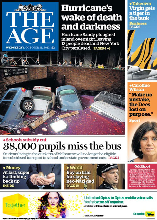
On Monday, March 4, 2013 Australia’s two major broadsheet newspapers, The Age and Sydney Morning Herald relaunched in a smaller size, referred to by the papers as ‘compact’. National Presentation Editor of Fairfax Media, Matt Martel talks about the research, planning and ideas that went into saying goodbye to the papers’ iconic broadsheet format and becoming tabloid in physical size but not in delivery.
Your title is National Presentation Editor? What does this involve exactly?
I lead a team of designers, graphic artists, illustrators and cartoonists. We help produce the Sydney Morning Herald, The Sun-Herald, The Age and The Canberra Times across all platforms. So our department, for example, does everything from the editorial-page cartoon through to complex data visualisations.
It’s one month on since The Age and Sydney Morning Herald hit news stands in their new compact form… Is it too early in the piece to ask how’s it going? Are their any indicators to the public’s reaction so far?
The public reaction has been fantastic. We have had relatively few complaints, certainly far fewer than I expected. The fact that one of the biggest issues was that there wasn’t enough space for answers underneath the Target puzzles tells me we haven’t really messed things up.
Would you say this is the most significant change to The Age and Sydney Morning Herald in their histories? (Of course there are moments such as the introduction of pictures or colour printing, but the broadsheet format seemed so inherent with what the papers ‘are’.)
Certainly, it is huge. But there have been other really big changes over the years, like you mention, The Herald, in particular, has changed sizes many times and it was originally launched fairly close to the size it is today. We used to have classifieds on the front; everything in black and white, non-modular design, no photos… it evolves.
What we didn’t do is change the content to any great extent. Tonally, the papers are the same. Because of that I feel that it is more of a physical size change than a reinvention of what the papers are. Having said that, we did change all the fonts (other than headline face), the colour palette, the grid, the general ethos of design and presentation, so there was a lot of change.
It must have been quite the feeling of responsibility to oversee these changes to titles with such heritage…
Yes. But where we have come from is far less important to me than where we are going. Many great papers, with fantastic histories, are now dead. We have to take care of the readers we have and give them what they want. In this case, it was more of the same wine, but in a new bottle.
Obviously the decision to make such a fundamental change to the product would have been based on a lot of research. What was the research indicating? Was it all just making it less cumbersome for commuters?
Less cumbersome; lower the barriers to reading; more friendly – they are all basically the same thing and they all indicate that the broadsheet is particularly problematic for commuters and people reading at their desk.
We heard very clearly in both cities that readers didn’t really mind if we changed the size of the paper, just don’t go downmarket. There were rumours put about that we were planning a full-on tabloid war with News Ltd. We never, ever were. It would have been suicide.
The research said we have to keep the papers pitched pretty much where they were and not have low-grade celebrities or tabloid stories in them. On one of the mockups we have a legitimate court story involving a celeb and readers were very clear that the mere fact she was a celebrity meant she shouldn’t be on the front page.
That is, I think, more of a Monday-to-Friday attitude. At the weekends, the research seems to show we have more scope to do lighter pieces.
Was the decision embraced overall within Fairfax or was it a contentious and tightly debated move?
Universally embraced. There were legitimate concerns about advertising yield, but there was no one saying we shouldn’t do it.
In the first compact edition on March 4th, you wrote “we did some outrageous versions of the Sydney Morning Herald and The Age… just to see what readers thought of them” – what did you come up with? Any chance of seeing one?
We played with renaming The Sydney Morning Herald smh. It didn’t go down so well. We also did versions with no text on the front, but readers want at least one story.
We had a great week in early November with the design consultant Mario Garcia where we basically just tried to be as out-there as we could. (A selection of mock up covers are in the gallery, above.)
You also wrote that when you heard the news Fairfax titles were moving to compact, you were in Europe and bought up hundreds of dollars worth of French, Spanish and Dutch newspapers. What did you see in or learn from them?
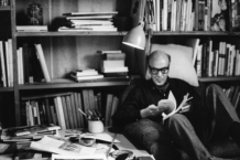
I’ve been designing newspapers for about 17 years now. The first paper I redesigned was the Sunday Star-Times in New Zealand when I was 23. I did a really awful job, but circulation jumped 10% in the first week and stayed there.
Over the years I’ve learnt to finesses and challenge designs much more rigorously. Looking at some of the fantastic European papers is always inspiring, but sometimes disappointing. I would love us to look more like papers like Le Monde or even the Portuguese paper i, but our market is so radically different.
We have to operate within the visual framework people expect of a newspaper in Australia. Where we push the boundaries, it can only be by a small amount each time. For example, when we launched Sport and Business as a compact section a few years back it was incredibly conservative on purpose. Over time you get to loosen up. Sport today is unrecognisable from what it was back then, but because we did the changes gradually we don’t upset readers.
With the European papers, I love their colour palettes, their typography and their use of illustration. I’d love to see us use more illustration on the front pages. I am really pleased with our almost entirely new typography and our new colour palette. Changing the traditional blue of the Herald and The Age was I think a big call. Those colours were very much part of the identity of each paper, but we seem to have gotten away with it.
That first edition also explained that the font size has been increased and the leading increased to increase legibility. Was legibility an issue that was expressed by readers?
Our readers are getting older. So was our publisher. It was a bit of a no-brainer. I would have done it years back if it had not been such a massive change for the system we use to produce the paper, Atex’s CyberGraphic. Every type size in the paper either stayed the same or went up.
With the smaller pages, larger font and larger leading, overall the paper feels ‘simpler’ – not quite dumbed down, but definitely like there’s less news on a page…
Yeah, that’s probably right because the pages are smaller. But there are more of them. The briefs across the top of pages (we call them balcony briefs) really push up our story count. The intention is that they allow us to do longer pieces below.
The paper states firmly that quality long form journalism is not affected by the changes, but it definitely seems like articles are now shorter, at least in the general news pages. But this is not the case?
Some stories are longer; others are shorter. It evens out. If you take the Focus spread, that’s the longest piece of journalism we’ve been able to run for many years. Some days that will be a 2500-word story plus graphic and breakouts. We simply didn’t have the space to do that in the broadsheet.
Fairfax charges advertising rates by the column inch correct? If the page is smaller does this mean revenue per ad will be lower? Can you charge the same price for a half page and full page add when the page itself is smaller?
I won’t even attempt to answer that, other than to say we don’t sell by the column inch, or cm. We charge by modules, based on percentage of page, regardless of whether it is broadsheet or compact.
On that topic, have advertisers given much reaction or feedback to the compact format?
Yes, of course. From what I understand it is almost all positive. But you’d need to talk to someone on the advertising side of the business about that.
Thanks for your time, Matt.
The Age
www.theage.com.au
Sydney Morning Herald
www.smh.com.au
By Matt Hurst
(all images, courtesy Fairfax Media)

Recent posts