-

Courtesy of Molecule.
Architect Robert Hamilton designed some of Melbourne’s most impressive Georgian-inspired homes in the 1920s and ‘30s. This one, located in a wide leafy street in the eastern suburbs, is no exception. From its impressive semi-circular forecourt overlooked by symmetrical bay windows, to its manicured gardens, the stately pile is both restrained and striking.
While the palatial home had undergone two previous renovations, one in the 1980s, and one a decade later, there were a number of small rooms (once used by maids) and awkwardly located gallery spaces. “Many of the rooms didn’t flow into each other, and some rooms, such as bathrooms, were quite clinical, at odds with Hamilton’s signature,” says architect Jarrod Haberfield, a director of Molecule, who worked closely with co-directors, architects Anja de Spa and Richard Fleming.

Photo Shannon McGrath, courtesy of Molecule.
The brief given to Molecule was to create basement car parking, as well as rework a number of the interior spaces, including new wallpapers and furnishings. “There’s a fine line between ‘replication’ and creating something new that’s respectful of the past,” says Haberfield, who was conscious, as were his colleagues of not creating a ‘jarring’ effect between new and old (the house dates to 1929).
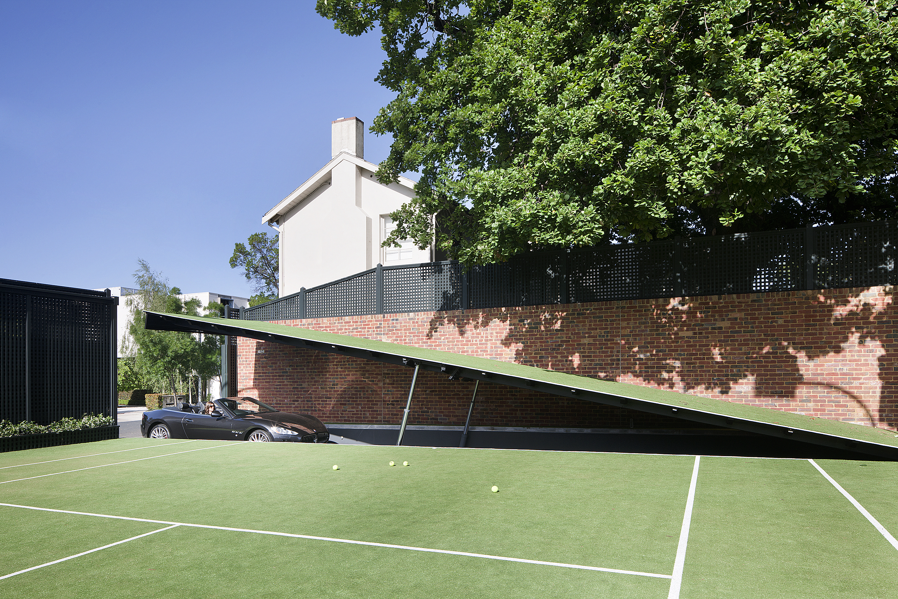
One of the main challenges for Molecule presented itself at the start of the project. Initially, the basement car parking was earmarked for below the existing tennis court. But a large water tank, already under the court, required another strategy to be adopted below a lawn in the rear garden. The architects literally used part of the faux turf on the tennis court to double as the garage door to the basement car park. The protrusion of the door in mid-air is likened to the bat cave, as seen in the Batman television series. But unlike the bat cave, this 12-car basement is finished as though an interior space, with timber battened walls and an impressive backlit polycarbonate ceiling. And, given the space, there was sufficient room for a home theatre and generous storage areas. “It’s more like a retail showroom,” says Fleming, pointing out the lighting system that allows sections of the roof to be illuminated over individual cars.

Photo Shannon McGrath, courtesy of Molecule.
And rather than simply taking a lift to or from the ground floor, as seen in many contemporary homes, Molecule carefully orchestrated a stairwell, thoughtfully aligned to one of the home’s original Georgian windows. “We wanted to open up the house as much as possible, whether it was to the garden or reflect back on the original architecture,” says Fleming. The dark-stained timber walls in the basement are ‘peeled back’ to reveal a suite of plush living areas at ground level and bedrooms on the first floor.
While Molecule didn’t touch all rooms, those they have reworked are impressive. The salon, located on the northern side of the house, is imbued with 1920s glamour. A timber fluted-edge credenza appears to ‘float’ above the customised carpets, many of which were inspired by the home’s original leadlight windows. Bevelled mirrors that frame the joinery further animate this room. “We designed everything from the basement car parking to the smaller details, even the cushions,” says de Spa, whose specialty was to create, amongst other details, the rugs throughout the home.

Photo Shannon McGrath, courtesy of Molecule.
The library adjacent to the salon, is as bespoke, with rich walnut timbers used for the built-in bookshelves. And just to add a little more intrigue, there’s a delightful private reading nook concealed off the library. The dining area, located on the southern side of the house, is also meticulously detailed. A gold foil damask wallpaper, evocative of the late 1920s, provides a more intimate backdrop.
For the informal living areas, adjacent to the kitchen, Molecule went for a lighter and more contemporary feel, both in furnishings and in colour palette. New bi-fold French-style doors leading to the northern rear garden are a subtle contrast to the more formal areas. The bedrooms, including the main, with his-and-hers walk-in dressing areas are as bespoke: ‘his’ lined with timber and capturing a ‘gentleman’s’ abode, while ‘hers’ features white-leather-covered joinery and more curvaceous lines.

Photo Shannon McGrath, courtesy of Molecule.
Finding a balance between past and present is an unenviable task for a designer: how far to push the contemporary boundary while still respecting the past. Molecule’s design strategy successfully bridges both periods, creating an enviable outcome in the process.
Molecule can be contacted on 03 9663 4455
Words by Stephen Crafti