-

Photo: Shannon McGrath
From the archive: Ten Darling Street by Neometro was named Highly Commended in the Interior Design Excellence Awards in 2010
This article was originally published in InsideOut Magazine in May 2009.
Natural Selection
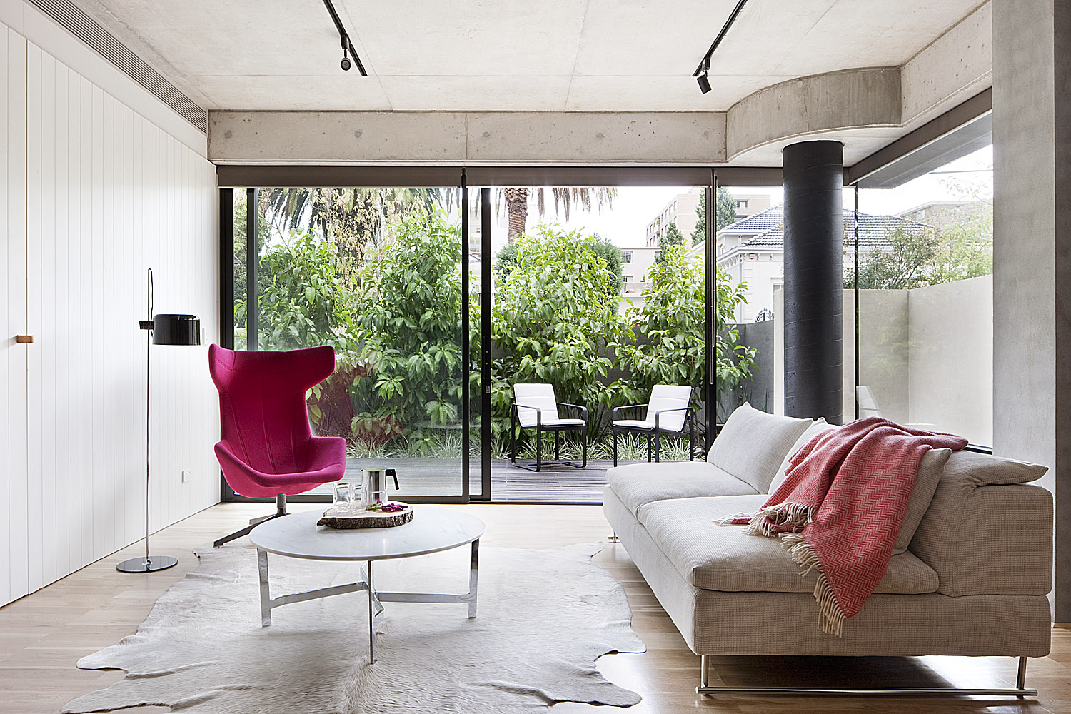
“Neometro’s long-standing philosophy is that when it comes to contemporary design, we’re offering the use of materials in their natural state,” Jeff Provan, design director of the firm explains. Concrete and timber are particular favourites, “because they wear in rather than wear out.” This apartment from the Ten Darling complex showcases his approach. “Concrete gets a patina and has a texture, so it’s not cold and bland. When natural materials age, they do so gracefully, whereas applied finishes can look grubby or chipped; they don’t have the full integrity of the real thing.”
Truly canny small-space design not only gives the impression of roominess, but makes the finished home comfortable for the owner and entirely workable. Clever architectural devices and interior fittings can turn even the tiniest floorplan into a high-impact home.

Photo: Shannon McGrath
Jeff Provan knew he faced some challenges when he began work on Ten Darling- a hip apartment complex in Melbourne’s South Yarra that his firm was to design and build. Each apartment was small, and he wanted the building to be as green as possible.
The solution he came up with: compact living that uses a lot of natural materials, incorporating only a few necessary compromises without cutting back on style.
“Everything has got to have its place, and everything is tucked away,” Jeff says. “When you’re eating and living in your dining room, and your study is also in your living room, you have to create all these zones and spaces. Things have to double up; your computer desk is also your breakfast nook!”
Built-in Benefits
In Ten Darling, smart storage is essential. “You need the right amount of shelving, and extra shelves on top of hanging space, because you don’t have the luxury of more room,” explains Jeff. “Everything has to be efficient- especially in the kitchen, where we have an integrated fridge and a pantry that doubles as an appliance cupboard. It’s not about the visual look of the kitchen, it’s about being practical,” he says.
In small apartments, from a purely practical point of view, most storage needs to perform a double duty. In this one, joinery has been built against walls to enhance the decor as well as act as a room divider- creating the marking off new sections, such as an office area. Another advantage of incorporating wall joinery is that it’s not as “obtrusive into the visual space.”

Photo: Shannon McGrath
Finish with Furniture
“When you work on a design, you also have to be careful about the furniture you choose. Really good pieces are notable for their contours, and anything designed well stands on its own two feet,” says Jeff. Throughout the apartment are iconic items, such as Herman Miller plywood dining chairs by Charles and Ray Eames fanned out around an elegant, minimal Knoll ‘Saarinen’ table by Eero Sarrinen and, in the study area, Carl Hansen & Son ‘CH24’ chair by Hans J. Wegner (its backrest shape explains the Wishbone nickname given to this famous design). “They’re beautiful things to look at and to sit in. Whatever you try to do with your apartment, you’re trying to make people people comfortable and relaxed in it.”
Screen Saver
“The bathroom can either be used as an ensuite or as a facility shared by both the main and guest room,” says Jeff. In this space, he used small tiles on one wall and large stone versions on the floor because, “It’s a nice little detail but really quite timeless.” To make the very most of the compact area, Jeff included seamless connections between the shower screen and the walls and floor, so the space isn’t visually broken up. The floor-to-ceiling window allows in abundant natural light, which, when reflected in the mirror, makes the ensuite feel light and airy.

Photo: Shannon McGrath
Palette Performers
The selection of tones throughout the home suits a range of moods and functions. “We tried to play on various features by using colour to highlight or bring something in from the garden, or something that we’d seen on site. We used tints sparingly, but they add a bit of fun, otherwise everything becomes a bit serious. And with colour, things are easily changed,” says Jeff. “Natural hues give a bit of freshness; for example, greys work well with timbers, and a little splash of colour can add sparkle. The fuchsia is really referencing the work of Luis Barragan, the Mexican architect who loved using this intense pink in small hits. It just brightens things up and is cheery.” In addition, the artworks on the walls- by Australian artists such as Adam Cullen and Melinda Harper- compliment the chosen hues.

Photo: Shannon McGrath
Design Philosophy
“Neometro’s philosophy is about integrating interiors, architecture and landscape. We try to do a marriage of all of these fields, so there’s no real defined line between where the architecture stops and the interior design starts,” Jeff explains. “It’s compact here- people are paying a lot of money per square meter, so they don’t want a space that they can’t use. Every room has its own particular function, including the small outdoor area, so you have multi-use spaces.” In the kitchen, for example, there are no handles on cupboards, creating a free-flowing effect, so the area merges seamlessly with the living zone. It shows that smart integration can revitalise even the tiniest of spaces.
Words: Rachelle Unreich