Club Neometro: Visnja Brdar
Design, People - by Open Journal
21st October, 2020.
From Melbourne to Milan, Paris to New York City, Visnja Brdar has established a refined, sophisticated and distinctly timeless aesthetic that has continued to define her graphic branding across continents and sectors. From Neometro’s company logo in the 90’s to the identity of luxury branded collateral created by her entity BRDAR, Visnja’s professional journey can be defined as tempered risk balanced by hard work.
Visnja Brdar is the formidable force behind some of the world’s most recognisable luxury branding across fashion, real estate and lifestyle genres. Her creative fortitude has been established upon the pillars of her upbringing, a tendency to wholeheartedly follow instinctual inclinations, and the multi-faceted experiences she has embraced along the way. Where others may label less than perfect outcomes “negative” and respond with dismissal, disregard or indifference, Visnja has consistently grown, evolved and leveraged outcomes for their opportune teachings.

Born to Croatian immigrants, Visnja grew up in Geelong before moving to St Kilda when she was 18 to study what was regarded as Australia’s best Graphic Design course at Swinburne University. She recalls her father, a house painter who donned a white shirt and tie beneath his daily uniform of painters overalls, as her primary early influence. His elegance, quiet dignity, and propensity for bettering himself, filtered into her own demeanor, leading to a determination — through a combination of hard work, perseverance and talent — to forge a career in her own right. On graduating, she turned down multiple offers of employment from Australia’s top branding agencies and opted instead to back herself.

Neometro brand identity circa 1995
In 1995, at the age of 25, Visnja designed Neometro’s first logo. She went on to fulfil engagements with some of Australia’s leading companies and brands over the following five years such as The Sydney Opera House, Marc Newson, Scanlan Theodore, Chris Connell, Jill Dupleix, Terry Durack, Leigh Prentice, DeDeCe, and Jenny Bannister. At the age of 28, Visnja was the recipient of the prestigious Victorian Design Award. A monumental step in the validation of her career and strong recognition of her rigorous and restrained aesthetic, harnessed in her design of Jill Dupleix’s cookbooks, which has come to define her work.

Brand positioning for Michael Kors & Neometro

NARS Skin Packaging

Marc Newson Limited Edition Book

Bally brand positioning

Bally brand positioning
Since those early years in Australia, Visnja’s affinity for realising timeless aesthetics that visually articulate a brand’s essence with zero fanfare has led to creative collateral responses that exude simplicity and intelligence. Today, her influence on Neometro’s branding continues to inform the company’s graphic identity, while Visnja presides over her New York City home base, BRDAR, where she orchestrates campaign content of preeminent scope for a covetable client portfolio. Her portfolio of New York clients includes the likes of Richard Avedon, Fabien Baron, Michael Kors, Van Cleef Arpels, Estee Lauder, NARS Cosmetics, Jill Sander, Issey Miyake as well as esteemed real estate companies Foster & Partners, SHoP Architects and Selldorf Architects.

Sixty East Eighty Sixth logo design / brand identity

Michael Kors Men brand strategy

Foster & Partners / 50 United Nations Plaza Advertising Campaign
Fast forward to 2020 and Visnja now has some clarity on some of the pivotal moments along her personal and professional journey. In the 90’s it was the confidence to go forth and prove herself. In the 00’s it was the lessons found in opening herself up to cultural influences and global idiosyncrasies. The absorbing of advice and opportunity doled out by leading, innovative mentors she worked with and for, eschewing hindsight for the more immediate and resonant experience. From Geelong to Melbourne, Paris to Milan, and London to New York, Visnja’s creative intrepidness, along with a healthy balance of fear and determination have seen her arrive at a place that bears its own visual identity. One that is devoid of white noise. A manifestation of her personal aspirations perhaps? If the estimable client list that she has accrued over the years were a belt, its notches would be deep.

Mrs John L Strong brand identity packaging

Left: Power – Large Pin, Right: Clarity – Diamond Pin. Both by Visnja Jewels

Visnja Jewels packaging
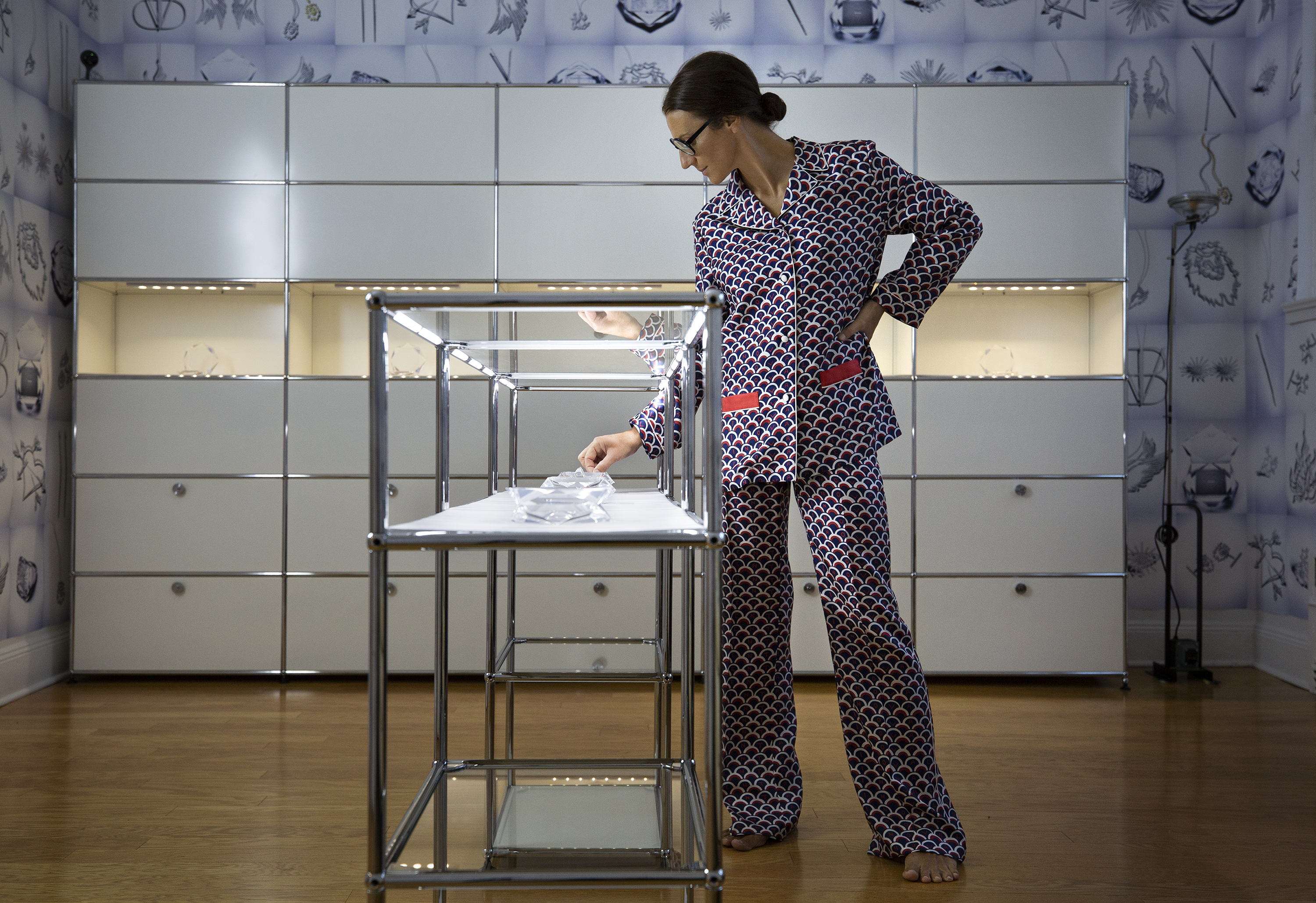
Recently, Visnja’s background has manifested in a brand of her own that is notable for both the refined beauty of its products, as well as the full circle journey they represent. Visnja Jewels harness all the luxury, grace, elegance and strength of Visnja’s life intents. They are her fortification. A considered design offering that pays homage to tradition while exuding her signature timelessness and enduring relevance. They are her legacy.
Words | Tiffany Jade

Recent posts