-

Photo: Peter Bennetts
To renovate or move to a new house is a dilemma facing many people. For Meahan, whose son Louis is now four years old, questions about whether to stay or move from a Victorian cottage in Albert Park, was a constant in her life. The single-fronted house, in a heritage streetscape, had been poorly extended in the 1990s, with little thought on orientation or how a family could live. “Meahan has an aversion to direct sunlight which was at odds with the glass box extension that had been added,” says architect Andrew Maynard, director of Austin Maynard Architects.

Photo: Peter Bennetts
When the initial conversation between Andrew and Meahan commenced four years ago, when Louis was born, the topic centred on clutter associated with young children. “I’d spent the last six years picking up my son’s toys in my own home and realised what Meahan faced for the next few years,” says Maynard, who recalls saying ‘how great it would be to open one’s door and put all the toys away in one clear swoop’.

Photo: Peter Bennetts
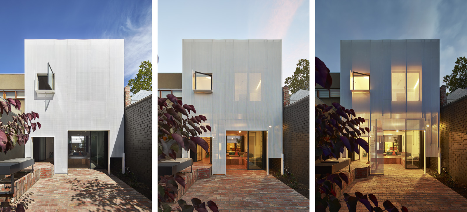
While this was a starting point in developing the built-in toy box within the raised timber floor in the living area, other ideas started to emerge. The powder- coated perforated steel screen at the rear of the house was another strong idea that became a driving force in Austin Maynard Architects’ design. “The orientation (to the rear) is north west, where the afternoon light can be quite aggressive,” says Maynard, who created a ‘veil effect’ beyond the new two-storey glazing. So while there’s a pop-out window in the corridor space outside Meahan’s bedroom, the large picture window in the main bedroom is fully screened from the afternoon light.

Photo: Peter Bennetts
The front of the house, including the original first room, has been retained. However, the contemporary intervention quickly unfolds. What was once the second bedroom are now a study nook and a guest powder room with shower, both overlooking the internal courtyard. And rather than a conventional kitchen and dining area, there’s a highly innovative arrangement. The kitchen bench, for example, forms part of the passage. And the dining area is elevated to allow seating at the kitchen bench. Maynard even included a pop-out seat in the black laminate bench to create extra seating. “It’s Louis’ favourite place to sit, ‘one foot in the kitchen and one in the dining area’ so to speak,” says Maynard. And to strengthen the connection to the courtyard garden, large sliding doors can be entirely pulled back.

Photo: Peter Bennetts
As novel is the arrangement of the living area, elevated above what was previously a shotgun corridor, to include a 1970s-style conversation lounge. Spotted gum veneer becomes both the floor of the living area as well as the lid to the toy box. “Meahan can literally get the floor to ‘swallow up’ the toys if family and friends are coming over,” says Maynard.
As the house is relatively modest in size, approximately 170 square metres, Austin Maynard Architects included a perforated steel floor for the corridor above. “Louis can open his bedroom door and call out to his mother in the kitchen,” says Maynard, who designed the steel floor to follow the configuration of the rooms upstairs, the two bedrooms and a bathroom. Large sliding doors between Meahan’s bedroom and passage also extend the usable space. “One of the problems with Victorian terraces is the wasted space. An extra couple of metres for the kitchen and bedroom can make a significant difference,” says Maynard.

Photo: Peter Bennetts
The customised fiberglass yellow bath, located at the front of the house, along with the angle of the new steel roof, were one of the challenges that kept the council’s planning department lingering over the application (12 months to receive approval). “There were concerns that you could see the yellow of the bath and a small amount of the roof from the other side of the street,” says Maynard, who pointed out that most of the time, the street trees covered any sign of new work. ‘It’s challenging when you’re renovating or building in heritage areas. The idea is to be total invisible,” he adds.

Photo: Peter Bennetts
While the renovation is virtually invisible from the streetscape, readers of Open Journal can enjoy the full effect by browsing through these wonderful recent images.

Photo: Peter Bennetts